
Improving Readability and Usability in Printable Memory Games for Seniors
To make printable memory games for seniors easier to read and use, combine clear, sufficiently large text, strong foreground–background contrast, visible spacing between playable items, concise instructions and a simple layout, then verify the result on the final printed sheet at the senior's normal viewing distance. RNIB's 14-point Arial clear-print specification and 16–22-point large-print range are useful reference values, not universal thresholds; individual vision, lighting, viewing distance and printer output determine what is actually usable. If the material is visually clear but the memory task remains difficult, treat that as a game-difficulty question rather than continuing to change the page presentation.
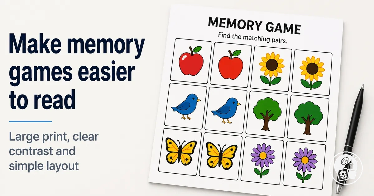
Final-print verification
Quick print-readability check
Use these checks on the physical sheet at the intended paper size and the senior's normal viewing distance. They assess presentation clarity, not memory ability.
0 of 5 checks met. Correct unchecked presentation conditions before changing the game's cognitive difficulty.
Typeface clarity, contrast, spacing and visual simplicity work together: a larger font cannot compensate for crowded spacing, weak contrast or unclear game elements. The practical test is whether the senior can distinguish and follow the required content on the actual printed page under the conditions in which it will be used.
Table of Contents
Use Readable Text and Instructions
Format the labels, prompts and instructions in printable memory games as readable text that remains clear and distinguishable on the printed page.
Font size should be large enough for the individual reader, but it should be evaluated together with typeface clarity, line spacing, alignment, instruction length and visual separation rather than treated as the only condition for readability.
These text-form and instruction-form variables work together: increasing font size does not compensate for an unclear typeface, crowded spacing or poorly separated directions.
RNIB states that its clear-print Word documents use 14-point Arial, while large print can range from 16 to 22 point, and it explicitly notes that no single size suits everyone.
W3C guidance also explains that short, common words and short sentences are easier to decode than long sentences or long and unfamiliar words, supporting concise wording where the game rule can remain complete.
Check the combined result on the final printed page because print size, printer output and individual reader conditions determine whether the selected formatting remains usable.
The annotated example below demonstrates this coordinated system with a clear instruction block, consistent text treatment, readable labels and visible separation between instructions and the playable area.
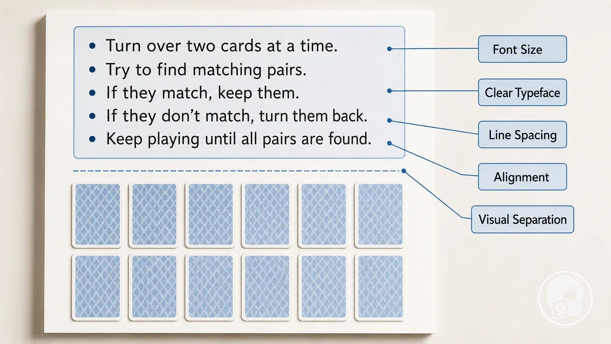
- Font size: use a printed size that the intended reader can distinguish comfortably; RNIB's 14-point clear-print specification and 16–22-point large-print range are useful reference values, not universal thresholds.
- Typeface: use clearly formed, consistent characters and verify their legibility after printing rather than judging the nominal point size alone.
- Line spacing and alignment: keep instruction lines visually separate and alignment consistent so the reader can follow the text block without unnecessary visual searching.
- Instruction length: keep directions concise while preserving every rule needed to play; W3C guidance supports short, familiar wording and short sentences where the meaning permits.
- Labels and visual separation: keep labels and instructions visibly distinct from the playable content so each text element has an identifiable function on the printed page.
Choose a Larger, Clear Typeface for Printed Text
Printed type for memory-game instructions, labels and prompts should use a font size and typeface that are large and clearly formed enough to recognise at the reader's normal reading distance, but no single point size is correct for every older reader or print condition.
RNIB uses 14-point Arial for its clear-print Word documents and describes 16–22 point as large print, while explicitly stating that no single size is suitable for everyone.

Judge printed type by nominal point size and visible character clarity together: font size establishes the nominal scale, while the typeface's character shape, x-height, stroke clarity and consistency determine how distinctly the letters appear after printing.
Vision Australia identifies distinguishable character shapes, larger x-heights, open forms and the avoidance of extremely thin strokes as relevant legibility characteristics; for example, at the same point size, a typeface with a larger x-height can display visibly larger lowercase characters than one with a smaller x-height.
Print output, paper size, reading distance and individual vision can change the resulting visual comfort, so the practical criterion is whether the printed characters remain consistently distinguishable under the reader's actual viewing and print conditions rather than whether the file meets one fixed point-size prescription.
Use Adequate Line Spacing and Simple Text Alignment
Instruction-text spacing and alignment should keep each reading line and paragraph visually distinct and provide a consistent starting edge for visual tracking.
For printed documents prepared for people with low vision, Vision Australia specifies left-aligned horizontal text with at least 1.5 line spacing and paragraph separation; the exact presentation should still be checked in the final printed layout because line length and reader conditions interact with spacing.

For vertical separation, Vision Australia recommends line spacing of generally 1.5 times the text size and paragraph spacing of generally 2 times the text size; for alignment and line-length control, it recommends left alignment and a maximum paragraph width of 80 characters, while warning that crowded text or excessively loose lines can hinder line-to-line tracking and that justified alignment can create irregular word spaces.
For example, applying the 1.5-times relationship to 16-point instruction text gives an illustrative line-spacing value of 24 points, while keeping the text block within 80 characters per line and left aligned provides a consistent edge for returning to the next reading line.
These criteria apply to page-layout spacing within printed instructions, not timing intervals used for memory training.
Keep Instructions Short and Visually Distinct
Game instructions should state the necessary action with concise wording while preserving every rule needed to play correctly.
W3C readability guidance uses 25 words as a typical accepted maximum sentence length for English secondary-education text and recommends dividing longer sentences where appropriate; this is a readability reference, not a fixed word-count rule for every printed memory game.
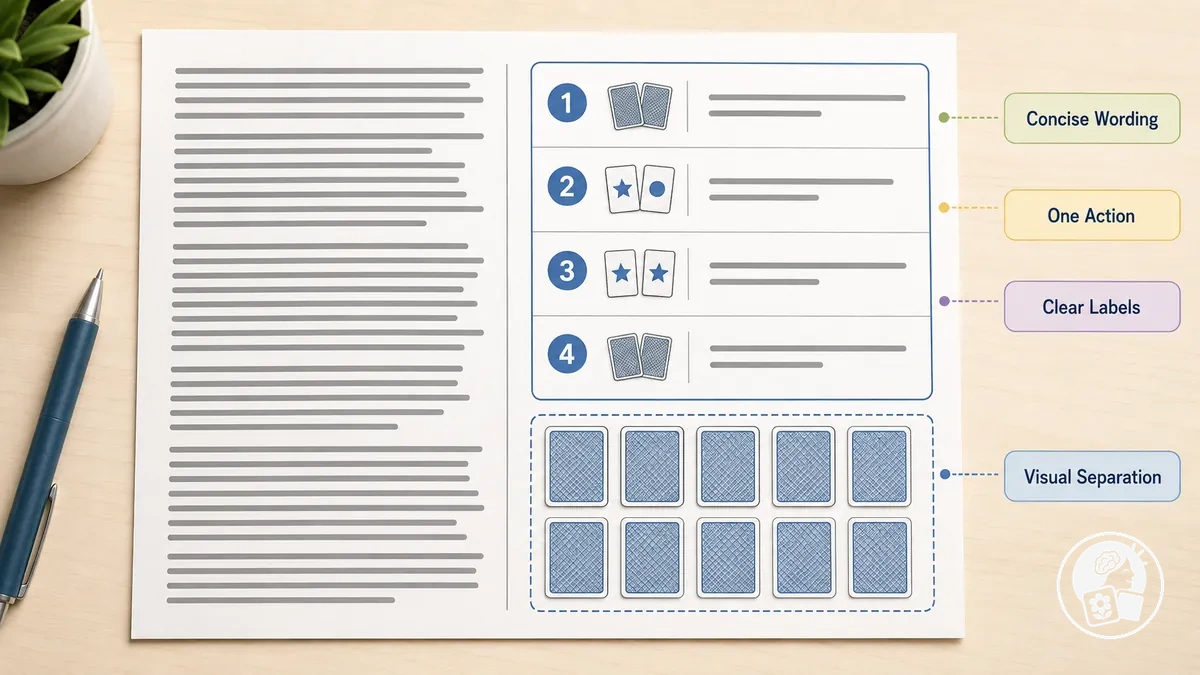
For game instructions, keep sentence length concise, state one action at a time, use clear labels, maintain consistent placement, and provide visual separation between the instruction block and playable content.
For example, an overloaded direction could read: “Begin by turning over any two cards and looking at both pictures, and when the pictures are the same keep those cards before continuing, but when they are different turn both cards face down again before taking another turn.”
The same rule can use concise wording: “Turn over two cards. If they match, keep them. If they do not match, turn both face down. Then take your next turn.” Both versions preserve the same four task conditions—turn two cards, keep a match, turn back a non-match, and continue—so the change concerns readability and visible presentation rather than the rules or difficulty of the game.
Make Game Elements Easy to See and Scan
Game elements in a printable memory game should be visually identifiable, separated from the background and arranged so the senior can scan the playable area without unnecessary competition for attention.
The visual layout should make each playable item recognisable as a distinct target before the player needs to interpret or remember it.
Contrast and element size determine the visibility of individual game elements, while spacing and visual clutter determine how clearly those elements remain separated during visual search.
Vision Australia advises using sufficient colour contrast, adequate space between elements and a consistent, logical layout in accessible documents for people with low vision.
These variables interact: visible boundaries support recognition against the background, while separation between neighbouring elements reduces competing targets during scanning.
Evaluate the visual layout separately from the memory challenge.
Enlarging game elements, increasing visual separation or removing nonessential decoration changes how playable items are presented and scanned; it does not by itself establish that the underlying memory task is easier.
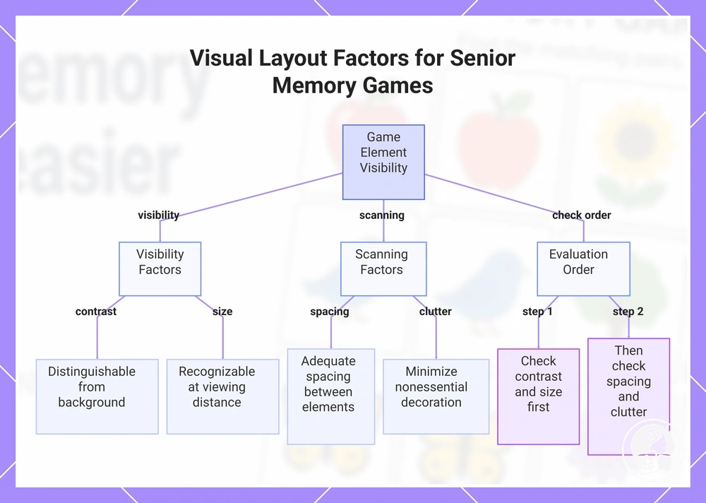
Check visibility first, then page-level separation: contrast and element size affect whether a target can be recognised, while spacing and visual clutter affect whether it can be isolated from surrounding content during visual search.
- Contrast: keep game elements visibly distinguishable from the background so their boundaries can be recognised rather than merging with surrounding areas; the sufficient contrast level depends on the colours, printed output and visual content being distinguished.
- Element size: enlarge playable items when their relevant pictures, shapes or symbols are not recognisable at the intended viewing distance. Do not assume one universal minimum card or picture dimension; use the final printed size and intended viewing condition as the recognition test, and stop enlarging before crowding reduces separation between items.
- Spacing: leave visible separation between neighbouring game elements so each target can be scanned independently rather than appearing as part of a crowded group. Vision Australia's guidance supports adequate spacing between document elements as part of a clear visual layout.
- Visual clutter: reduce nonessential decoration and competing graphics around playable items when those elements interfere with recognition or scanning. Keep decorative content subordinate to the game elements so the targets, rather than surrounding graphics, remain the primary objects of visual search.
This chart shows the key factors affecting visibility and scanning of game elements in printable memory games for seniors, and the recommended evaluation order.
Use Strong Contrast Between Important Elements and the Background
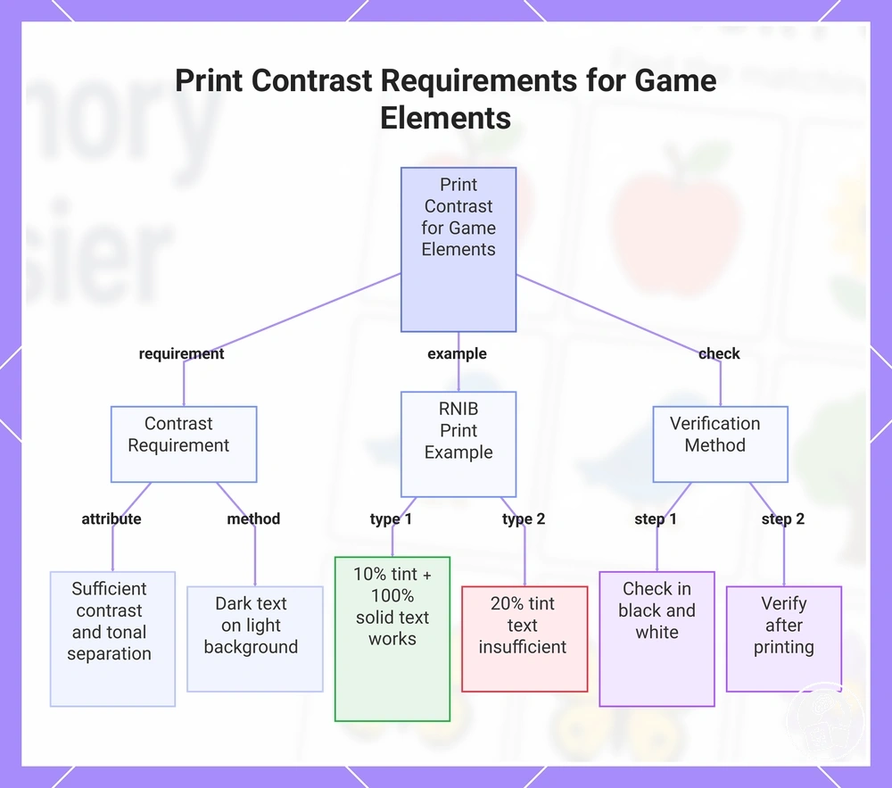
Essential game elements, including text, symbols and borders, need sufficient foreground-background contrast and tonal separation to remain distinguishable after print reproduction.
RNIB's print guidance states that text should contrast strongly with its paper or background and identifies dark text on a light background as the clearest general approach; practical sufficiency still depends on the printed foreground, background, paper and reproduction result.
Prioritise tonal separation for essential elements rather than relying on decorative colour to communicate game information.
In RNIB's print example, a 10% background tint can be paired with 100% solid black or 100% solid coloured text, whereas text at a 20% tint does not provide sufficient contrast against that pale background; RNIB also recommends checking uncertain colour combinations in black and white because different colours can have similar tonal values.
Treat these percentages as a specific print example rather than a universal contrast ratio: after printing, verify that text remains distinct from the background, symbols and borders retain recognisable boundaries, and essential information remains identifiable without colour differences alone.
This chart shows the core contrast requirements, an RNIB print example, and verification steps to ensure game elements remain distinguishable in print.
Separate Items With Enough White Space
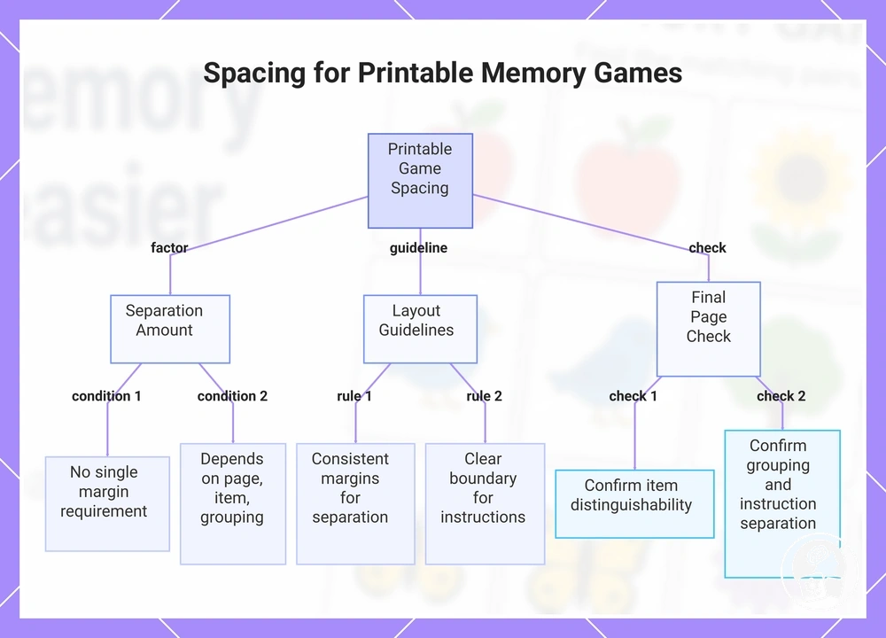
Use white space and margins to keep adjacent playable items, including choices, cards, words, pictures and response areas, visually distinct rather than allowing their boundaries to merge.
No single numerical margin should be treated as a universal requirement for printable memory games for seniors. Use enough separation that adjacent items remain visually distinct at the final printed size, while keeping related items close enough to read as one group.
Keep margins between playable items consistent enough to preserve visible separation, place a clear boundary between instructions and the play area, and group related items more closely than unrelated page regions.
Crowding can hinder scanning when adjacent items or playable regions appear to merge, while excessive white space can fragment the printed layout when related elements no longer appear to form one group.
Check the final printed page by confirming that individual items remain distinguishable, related items retain consistent grouping, and instructions remain visibly separate from the play area.
Here, spacing refers only to physical page-layout separation between printable elements and regions, not the timing of memory-training activities.
This chart shows the key factors, layout guidelines, and final checks for spacing playable items in printable memory games for seniors.
Reduce Decorative and Competing Visual Clutter
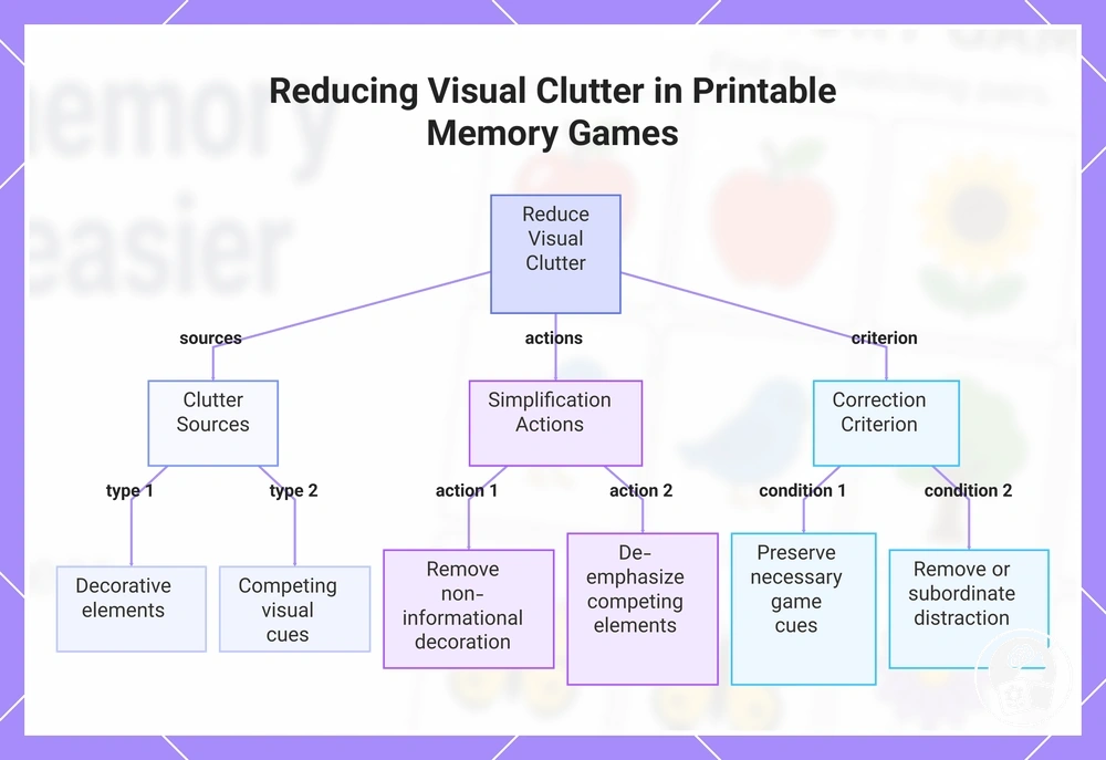
Reduce visual clutter in a printable memory game by removing or de-emphasising decorative elements that do not communicate game information, while preserving visual cues that identify a rule, category, boundary or match.
Decorative elements, competing borders, background patterns and unnecessary iconography can compete with relevant targets during visual search. Use a functional clutter limit rather than an arbitrary item count: keep a visual element when it communicates game information or supports recognition, and remove or subordinate it when it adds no distinct game meaning.
Apply simplification according to function: remove decoration with no game meaning, de-emphasise competing borders that merely ornament the printable, simplify background patterns that compete with playable content, and remove duplicated iconography or simultaneous visual cues when they communicate no additional game state.
Preserve a necessary cue when removing it would erase game information—for example, a border used to identify a meaningful card group serves a game function, whereas an ornamental border around the same group does not.
This useful-cue-versus-decoration test provides the correction criterion: retain visual information required for recognition or play and remove or subordinate visual distraction that adds no distinct game meaning.
This chart shows the sources of visual clutter, simplification actions, and the correction criterion for deciding what to keep or remove in a printable memory game.
Make Important Game Elements Large Enough to Recognise Easily
Essential game elements—pictures, words, symbols and response areas—should have an element size that allows recognition at the intended printed size and viewing distance.
No single width or height should be assumed for every game element. Size pictures, words, symbols and response areas so their required features are recognisable at the intended print scale and viewing distance; if enlargement causes crowding, simplify detail or improve contrast instead of increasing size indefinitely.
Evaluate physical size first by checking whether the required features remain recognisable in the printed version, then evaluate element size together with detail complexity and contrast.
RNIB's guidance on accessible learning materials states that pictures may need to be enlarged, modified, removed or replaced, and its guidance on modified visual materials recommends retaining important features while removing extraneous detail; RNIB also notes that enlargement alone can still leave unclear images, poor contrast or a confusing layout.
This means an enlarged picture or symbol should be simplified or given clearer contrast when its necessary features remain difficult to distinguish, rather than enlarged repeatedly.
Available page space sets the final constraint: enlargement may improve visibility, but it should stop before essential game elements create crowding that reduces their separation on the printed page.
Check Readability at the Final Printed Size
Check readability on the final printed memory-game sheet at the intended paper size and ordinary viewing distance, rather than inferring readability from the screen preview.
The design passes this verification only when the relevant printed conditions are observable at the intended size and use distance.
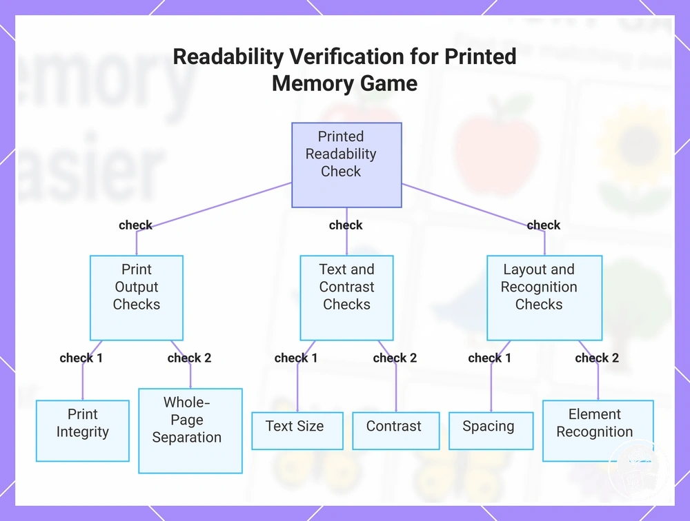
Print the sheet at its intended paper size and inspect the print output for printer scaling, text size, contrast, spacing, element recognition and instruction clarity.
Do not use one universal viewing distance, printer-scaling tolerance or pass threshold for every senior. Verify the physical sheet at the reader's normal use distance and intended paper size, and treat unintended scaling or cropped required content as a print-integrity failure.
- Print integrity: verify that printer scaling has not unintentionally resized the game and that required content is not cropped at the intended paper size.
- Text size: inspect printed instructions, prompts and labels at the intended viewing distance and check that their characters remain distinguishable.
- Contrast: check that essential text, symbols, pictures and boundaries remain visually distinct from their printed backgrounds.
- Spacing: check that adjacent playable items retain visible separation rather than merging into crowded groups.
- Element recognition: verify that essential pictures, words, symbols and response areas retain the features needed for recognition at the final printed size.
- Instruction clarity: check that the instructions remain easy to locate and distinguish from playable content.
- Whole-page separation: scan the complete printed sheet and verify that instructions, playable regions and response areas remain visually distinct as separate functional areas.
If a check fails, identify and adjust the corresponding presentation variable, such as printer scaling, text size, contrast, spacing or element size, and then reprint or recheck under the same intended conditions.
Reassess the failed condition until it is observable on the final print rather than using a change to the game's cognitive challenge as a readability correction.
After the final printed memory-game sheet meets the relevant checks for its intended use conditions, prepare and introduce the game using that verified print output so the checked presentation is the version used for play.
This chart shows the key checks to verify readability on a printed memory-game sheet for seniors, covering print output, text and contrast, and layout and recognition.
Distinguish Readability Barriers From Game Difficulty
Readability barriers and game difficulty describe different problem states in a printable memory game: readability barriers concern perceiving or interpreting the material, while game difficulty concerns the cognitive demand of the memory task once the material is sufficiently perceptible.
Trouble with text visibility, element recognition or locating instructions is therefore more consistent with a presentation barrier; difficulty that remains after those observable cues are addressed should be evaluated separately as a possible challenge-level issue.
Compare the observable cues before changing the memory task, because this distinction prevents a presentation problem from being treated as a game-difficulty problem.
Check whether the player can see the text, distinguish the playable elements and locate and interpret the instructions, then compare those observations with task performance after the same material is visually clear.
| Observable cue | Presentation barrier | Game difficulty after presentation is clear |
|---|---|---|
| Text visibility | Required instructions, labels or prompts are not reliably perceptible in the printed material. | The text is perceptible and understandable, but the memory task remains difficult to carry out. |
| Element recognition | Required pictures, words, symbols or response areas cannot be reliably distinguished. | The elements are recognisable, but remembering their locations, relationships or previous states remains difficult. |
| Instructions | The directions are difficult to locate or interpret because of their presentation. | The directions are locatable and understandable, but completing the required memory operations remains challenging. |
If task performance improves after a presentation barrier is corrected, the observation suggests that readability contributed to the original struggle.
If difficulty persists after text visibility, element recognition and instructions are sufficiently clear for use, the remaining difficulty warrants a separate assessment of cognitive demand rather than further readability changes.
Persistent struggle by itself does not establish a visual or cognitive diagnosis because the comparison provides a decision boundary, not a diagnostic threshold.
Reassess game difficulty only after the evident presentation barriers have been addressed.
Address evident presentation barriers first; if the material is perceptible and the memory task still presents difficulty, separate readability from difficulty level and reassess the challenge level as a separate decision.